
Color contrast checker
![]() Feb 13, 2024
Feb 13, 2024
The foundation of digital accessibility lies in design. But too often, designers fail to consider how their choices impact users with various disabilities. Color contrast is one of the most overlooked accessibility issues in web design, negatively impacting individuals with visual impairments such as color blindness. Fortunately, color contrast checkers can help.
What is color contrast?
Color contrast refers to the difference in color between a text (or graphical element) in the foreground and its background on a webpage. For people with color blindness and other visual impairments, websites can become inaccessible when the color contrast between the text and its background is low.
But color contrast is both a design and accessibility issue that really affects everyone. For example, a yellow or gray font on a white backdrop is going to be difficult for anyone to see.
Providing sufficient color contrast ratios will allow all users to comprehend content accurately, resulting in a better user experience for all visitors.
Why use a color contrast checker?
A color contrast checker is a digital tool that determines whether the color contrast on a site is accessible to people with color and vision impairments. This easy-to-use tool checks a site directly against the Web Content Accessibility Guidelines (WCAG) criteria for color contrast.
Color contrast checkers are crucial for designers to make sure their creations are accessible to all users. With this tool, designers will be able to verify that their color choices meet the required web accessibility guidelines.
Although it requires manual testing of each color combination intended for a design, the effort is worth it. Once all the color combinations that pass WCAG criteria are found, the ratios can be recorded and used to design a website with adequate color contrast in mind from day one.
How does a color contrast checker work?
As previously mentioned, a color contrast checker compares a foreground color and background color to check contrast for accessibility. After every color combination is tested, the WCAG checker will determine which combinations conform to the contrast standards.
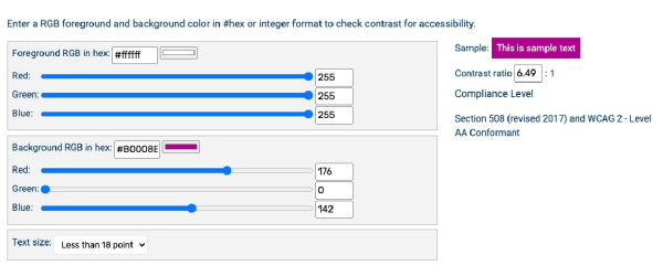
Usually, checkers will provide the highest conformance standard (WCAG level AAA) when combinations are tested, but not all organizations may be targeting level AAA. Depending on a brand’s color palette or style guidelines, these criteria may not be easily achievable for all sites. For this reason, it’s recommended that organizations strive for level AA conformance as a baseline, aiming to target AAA ratios when and how they can. WCAG has three level AA criteria for color contrast:
- 1.4.3 — Minimum Contrast: the contrast ratio between text elements and background must be a minimum contrast ratio of 4.5 to 1. Large text, however, requires a ratio of 3 to 1.
- 1.4.11 — Non-Text Contrast: non-text elements such as buttons and graphical objects require a contrast ratio of 3 to 1. This also applies to interactive elements, such as a button in both its “active” and “inactive” state.
- 1.4.1 — Use of Color: designers should not use color alone to convey meaning, information, or action.
For more information, access our blog on how a color contrast checker can improve web accessibility or check out our free color contrast checker to see it in action.
The Forrester Wave™: Digital Accessibility Platforms, Q4 2023
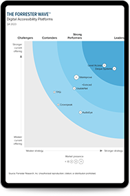
The first-ever digital accessibility Forrester Wave provides objective analysis of the most significant solution providers, recognizing Level Access as a Leader.
Access the report